"Zlatni Migove" (Golden Moments)
Technologies used
- Astro
- TailwindCSS
- Photoshop
- Illustrator
- InDesign
- Figma
Project overview
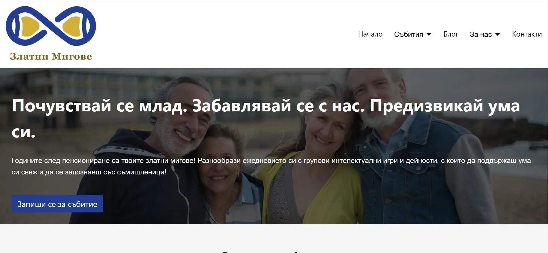
"Zlatni Migove" (meaning "Golden Moments" in Bulgarian) is a fictional senior club that hosts various intellectually stimulating events like quizzes and board games. The concept for the brand was conceived (in collaboration with other students) as a course project in the discipline Marketing planning during my fourth year in university. The concept was developed as an answer to the various social and health challenges that the seniors in Bulgaria face throughout their retirement years, such as social isolation and degrading mental capacities. This fictional club aims to solve these problems by providing an outlet for the seniors to engage in mental tasks that keep their minds fresh in a fun and engaging way and a community of like-minded seniors that may face the same needs and challenges. Thus, the values of the brand include inclusivity, unity, and, rather contradictorily, modernity and traditionality.
During my last semester, I had the opportunity to develop the creative concept of the brand as an individual course project for the discipline Graphic design. The whole creative concept relies on a few things:
- A complementary color palette to establish a strong contrast, which helps the seniors as many of them are hard of seeing
- A minimalist and clean design that utilizes basic shapes (like rectangles) that are rounded. Shapes like rectangles feel familiar and calm to the seniors, while their round edges and the minimalist design gives them a feeling of modernity instead of making the seniors feel "outdated"
One of the materials that I developed was the logo of the brand, which I made in Illustrator. The logo represents an hour glass rotated 90 degrees to resemble the infinity symbol. This symbolizes the eternity of the "golden moments" of the retirement years. Its horizontal position further supports this notion, as the hour glass does not typically run when in a horizontal position. Finally, the sand inside the clock is an irregular shape whose curves fit in with the curves of the hour glass, symbolizing that the seniors do have a place where they belong.
The end result consists of a landing page, coded with Astro, and a sample flyer and a Facebook post, developed with InDesign (with some minor image editing with Photoshop). The layout of those formats combines modern elements and simplicity, in order to provide a familiar and unobtrusive experience when interacting with those materials.